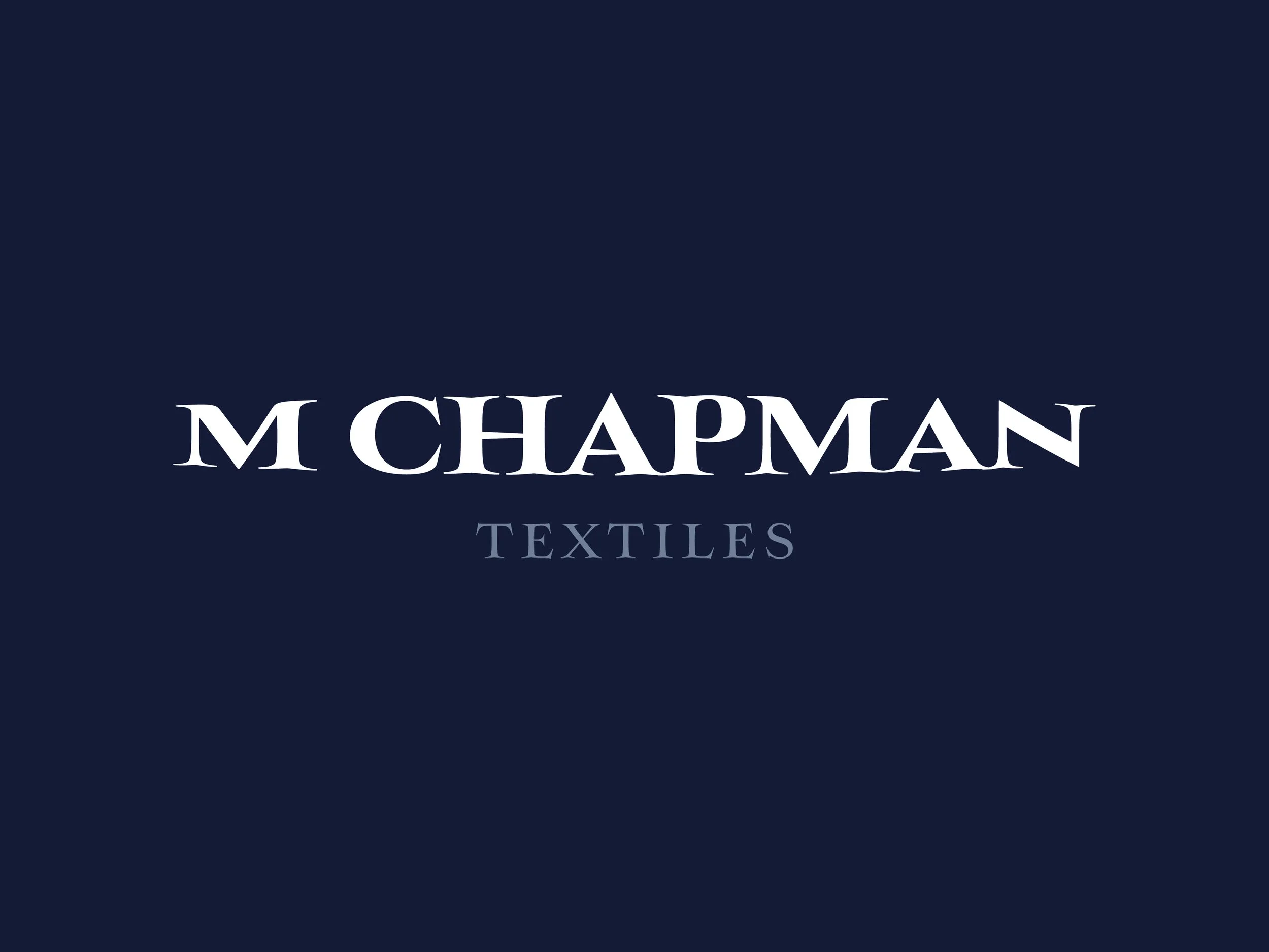
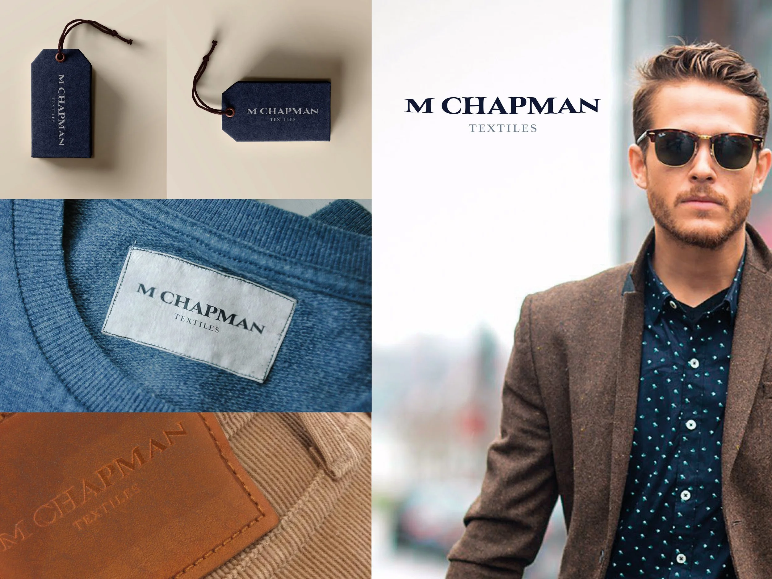
Case Study 1.
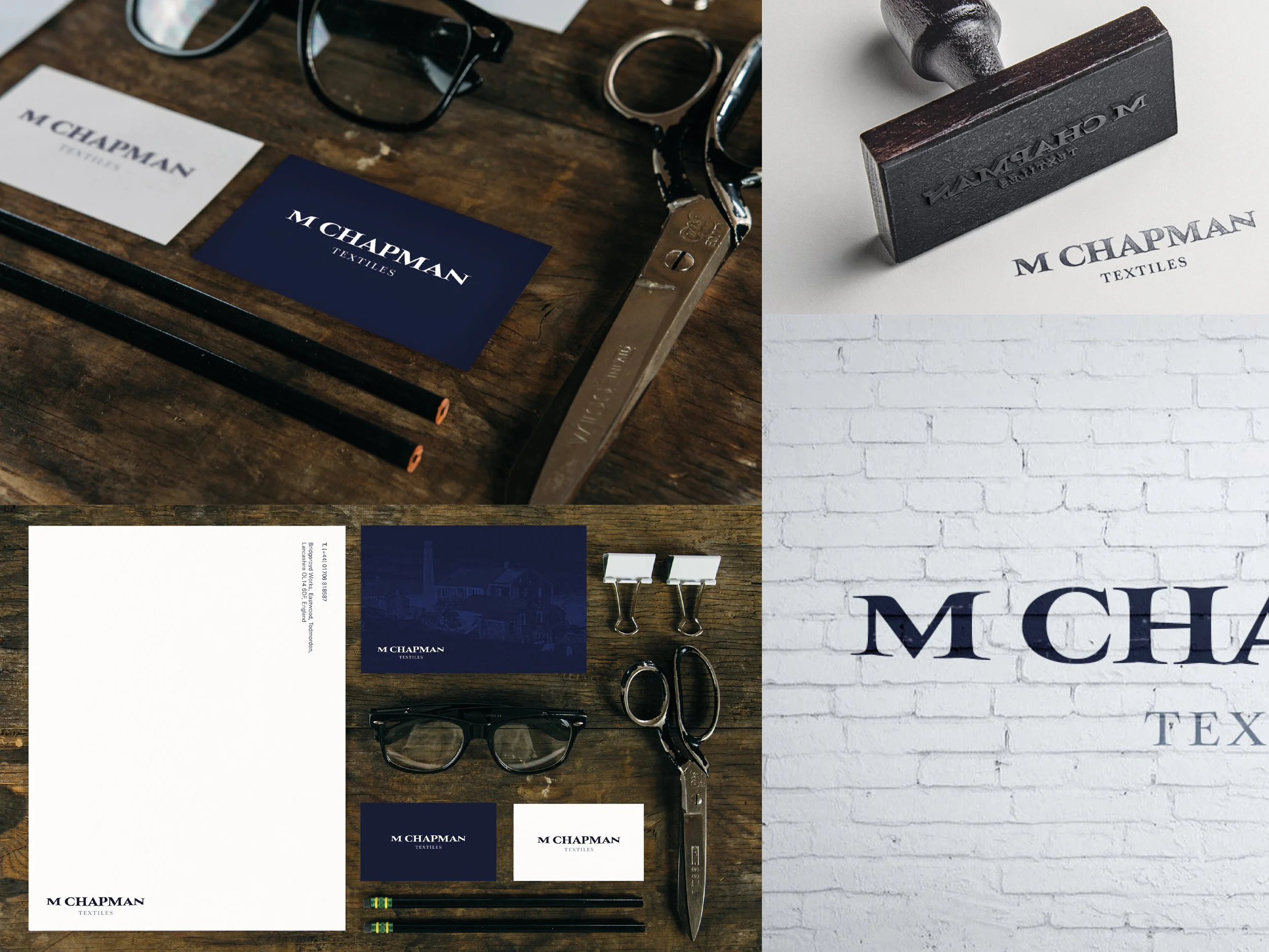
M. Chapman & Sons wanted a brand refresh that kept them recognisable, but more appealing to high-end design houses looking to buy fabrics.
Concept: Heritage redefined
Refreshing their brand by: removing the outdated (and low-res) bridge graphic, adding a subtle ‘stretch’ effect to the wordmark to simulate ‘breaking in’ and ‘give’ in new clothes. Keeping a nod to brands’ heritage by: keeping the serif font and creating a new colour palette that reflected clothing dyes.
Case Study 2.
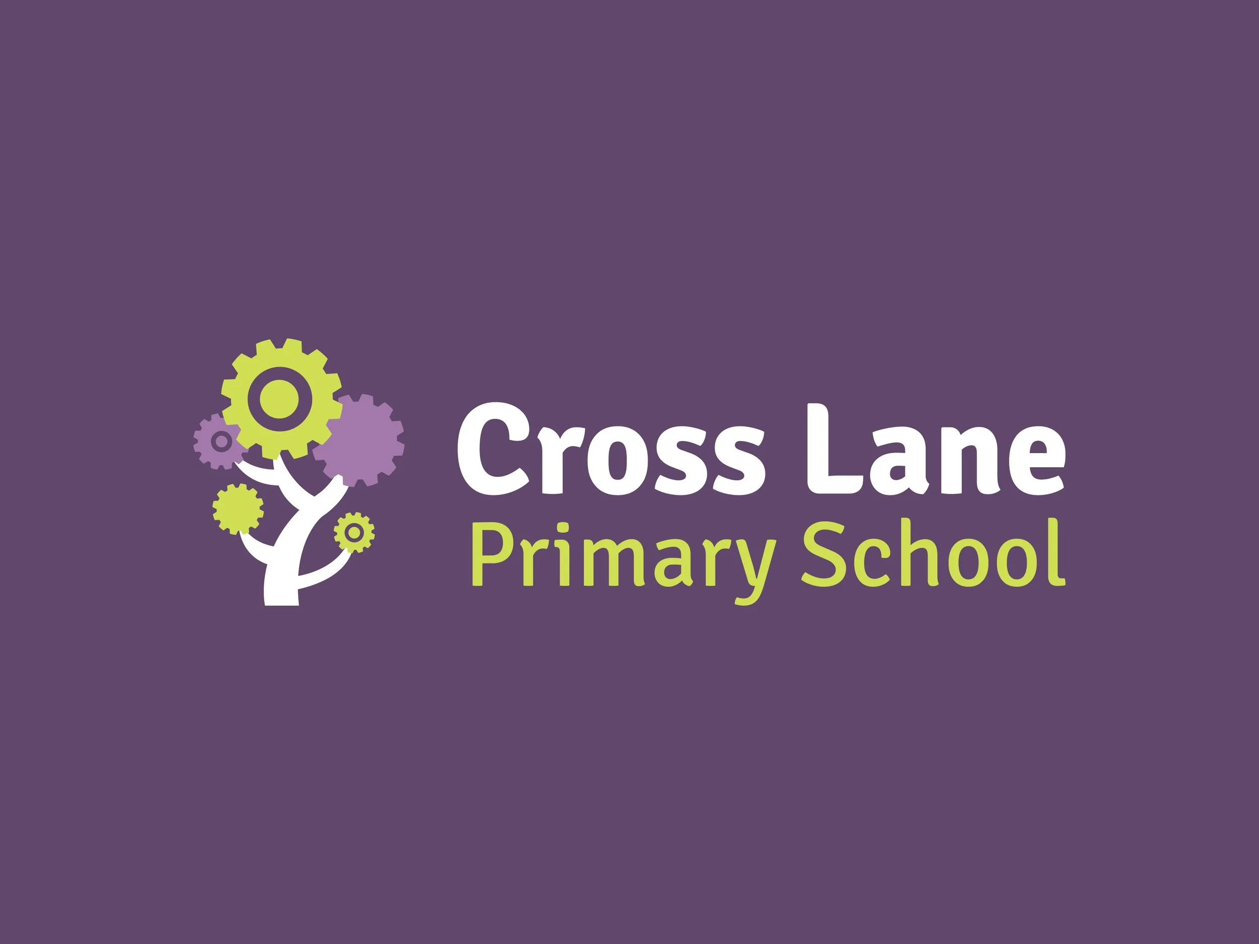
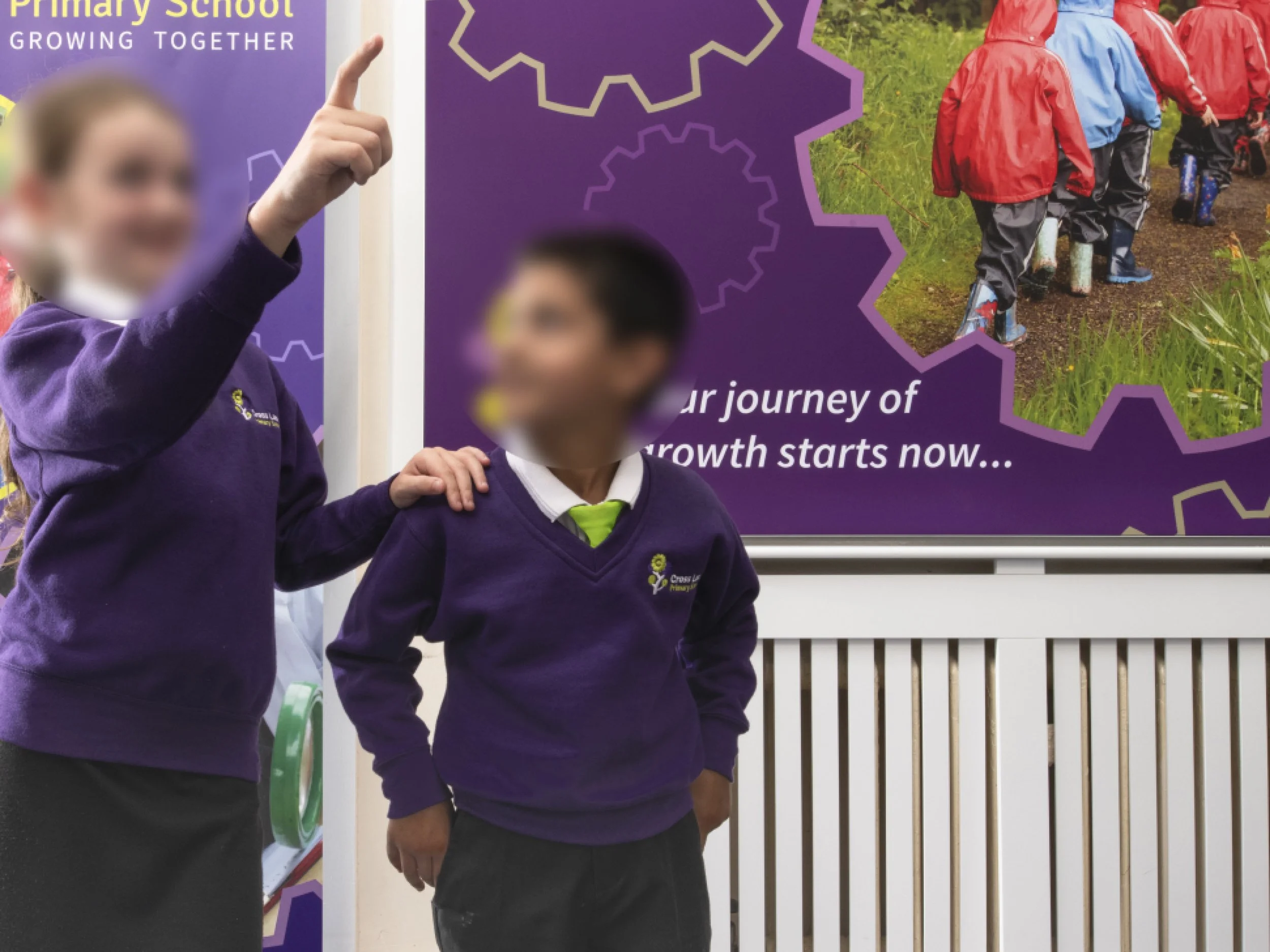
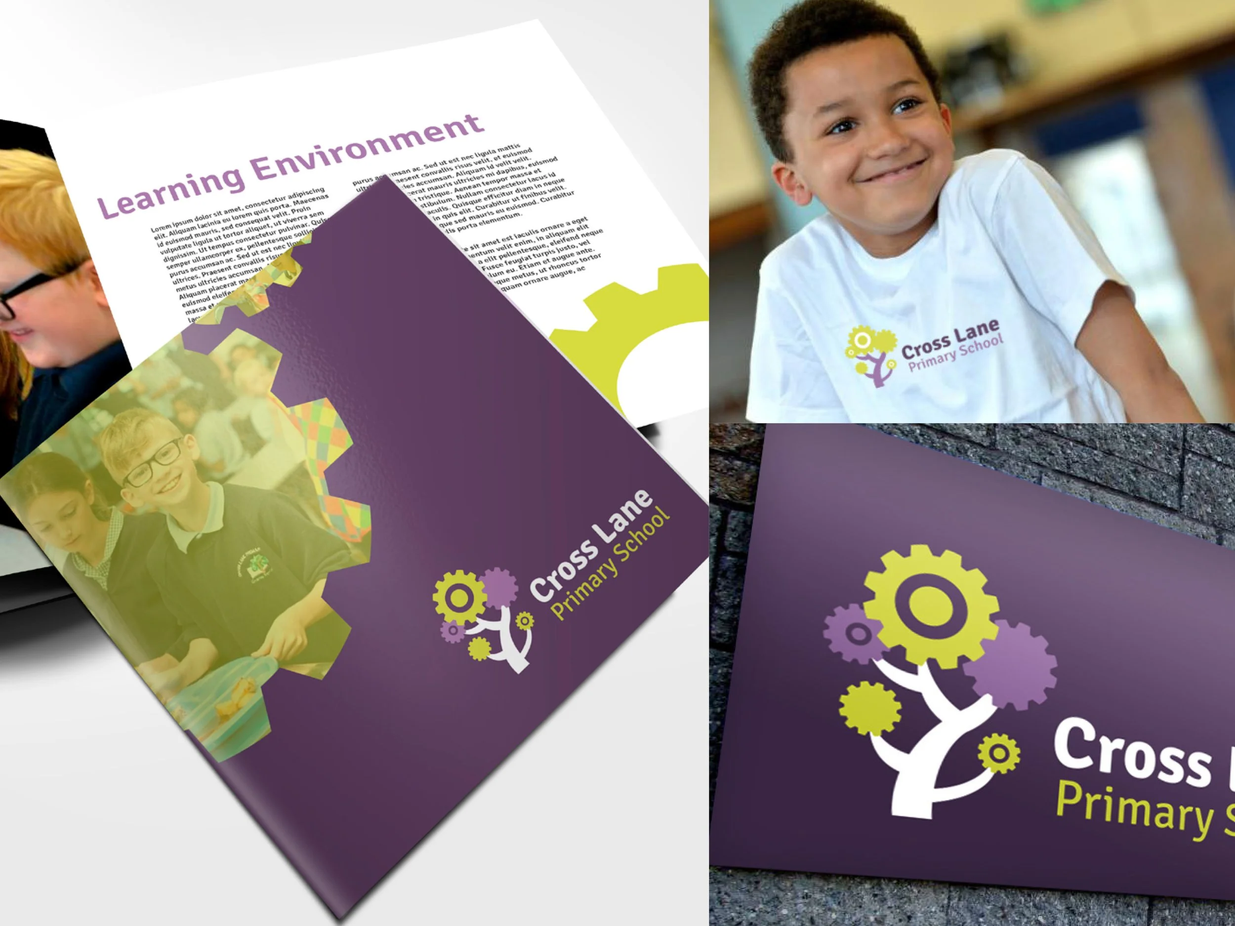
Cross Lane Primary School wanted a brand refresh that better reflected their core values and modernised their appearance.
Concept: Growing together
Tying into the nature theme that their existing brand had by: keeping the recognisable imagery of a tree. Modernising the brand by: adding a new, quirky cogwheel pattern for the leaves - both reflecting working together as one unit, and giving a nod to the quirky character that the Calder Valley area is known for.